Nespresso
Art Direction & Design | Agency: Fluid
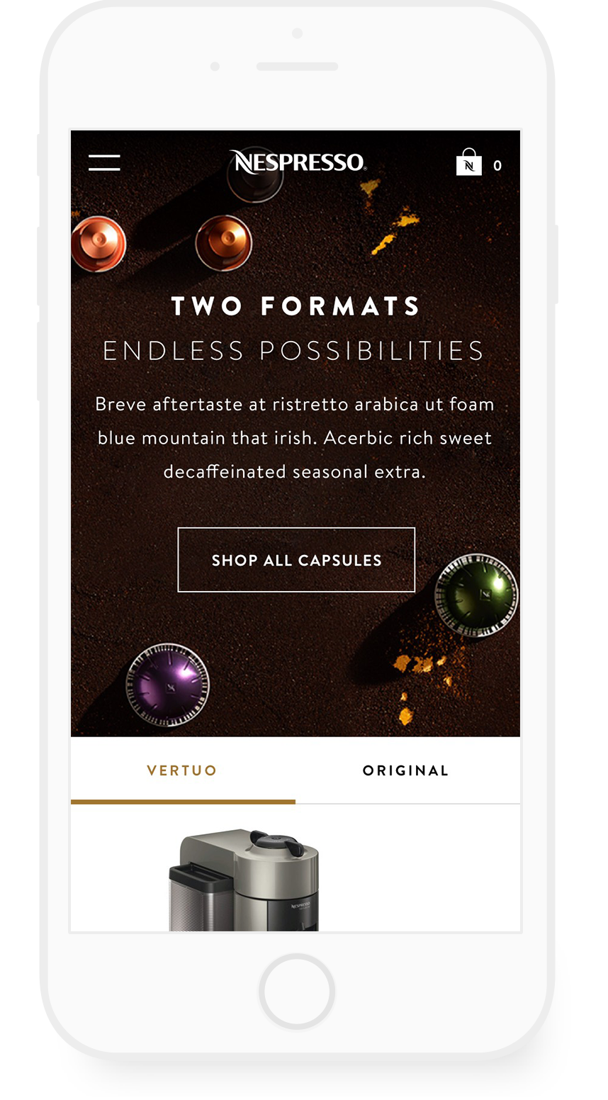
Nespresso machines are found in kitchens around the world. The launch of the Virtuo coffee series in America was the main push for this redesign since this line is meant to attract customers who prefer the taste of coffee over espresso. Providing a rich, experience with guidance around the two product lines was an important part of the redesign.
Nepresso's product range has a bit of a learning curve. The homepage inspiration in the form of recipes and gives the user a few good places to start browsing.


Hovering on a product tile while browsing provides some welcoming information. For grand crus, the flavor profile is described in detail. For machines & accessories, the usage and capsule compatability are explained


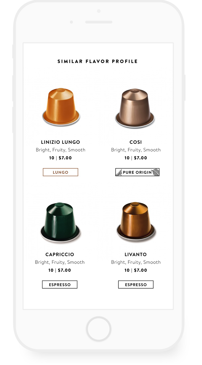
For individual Grand Crus, the product detail page contains rich details about each unique blend with clear product specs that allow the visitor to fully understand the flavor profile, similar blends and machine compatibility


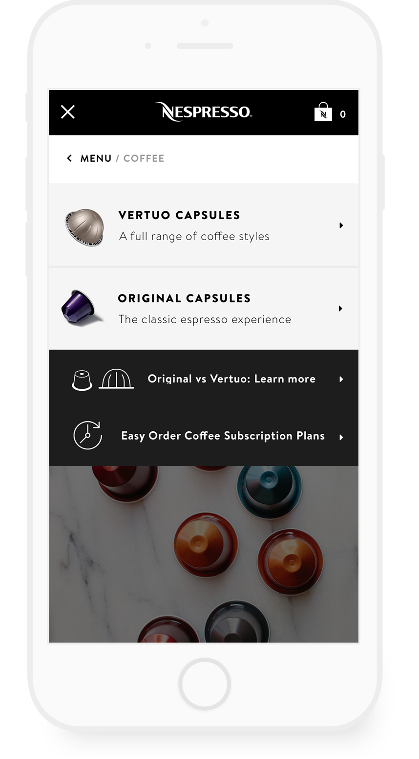
A visual navigation fixes what is a more mysterious experience on the current site and helps to better guide visitors toward the right product for them. A promo area gives the brand more space to use their voice and promote product highlights that might otherwise get buried.


This eductational page breaks down the two main product lines so they are easier to understand.